My role
UX Designer working closely with PM, EM, Web Devs, Android & iOS Devs
- End-to-end UX design
- Discovery & stakeholder research
- Information architecture redesign
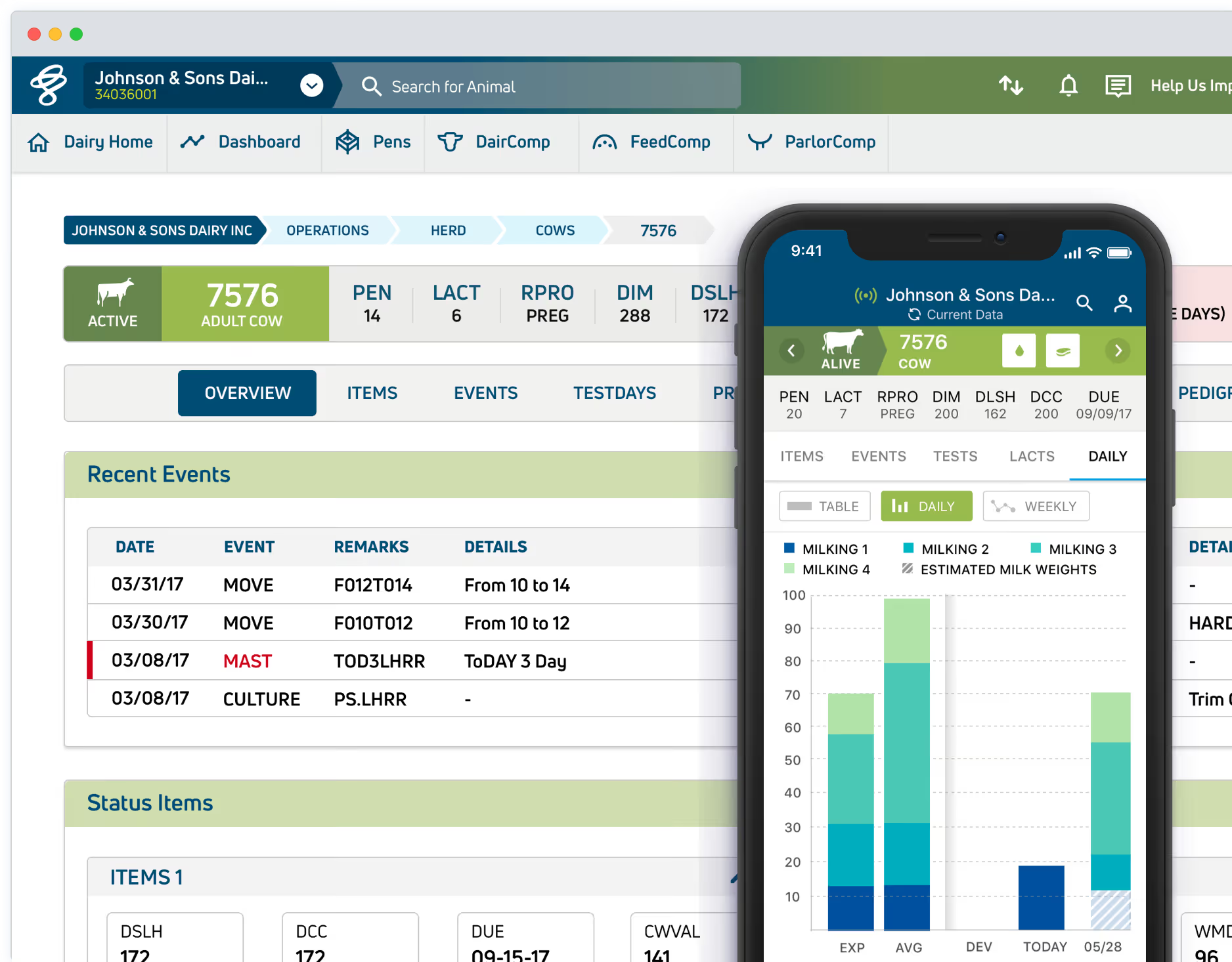
- Web + mobile platform design
Context
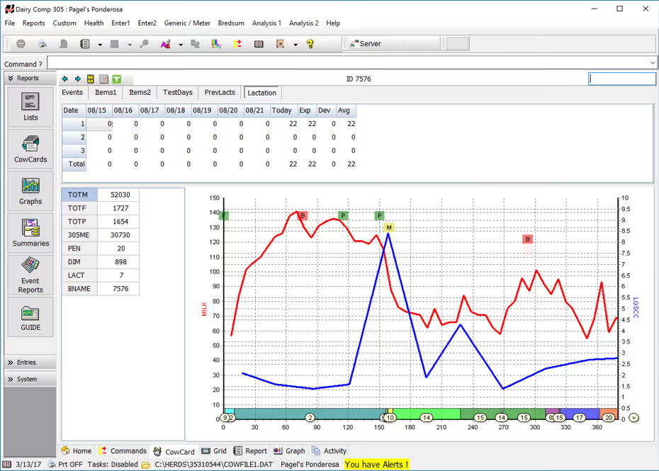
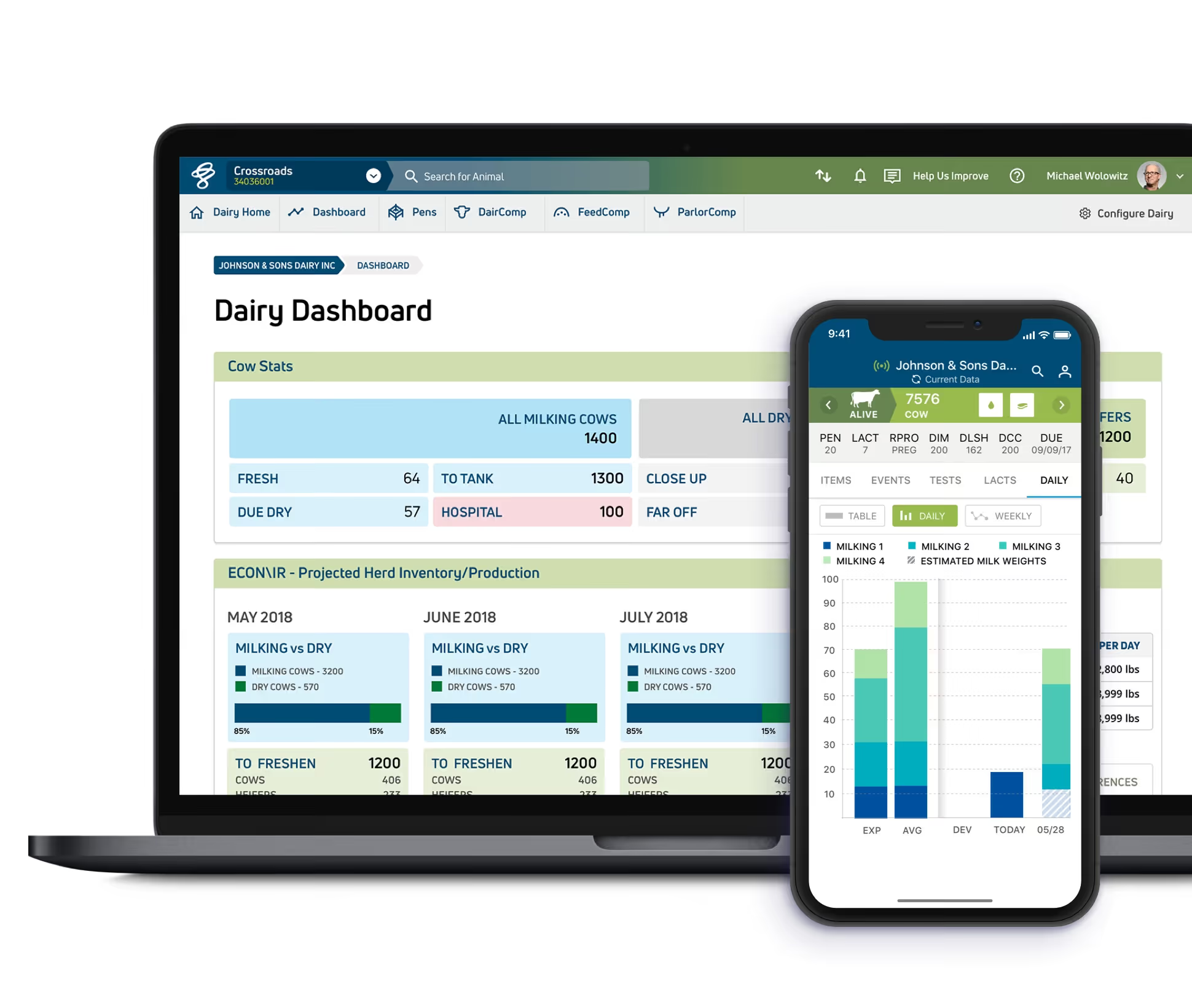
VAS is a leading dairy management software provider in the US. Their legacy desktop application was deeply embedded in daily farm operations — making change risky and sensitive.
The goal was to modernise it into a web hub and a field-ready mobile app without disrupting the highly specialised users who depended on it every day.
The Challenge
Translate a complex, legacy desktop system into:
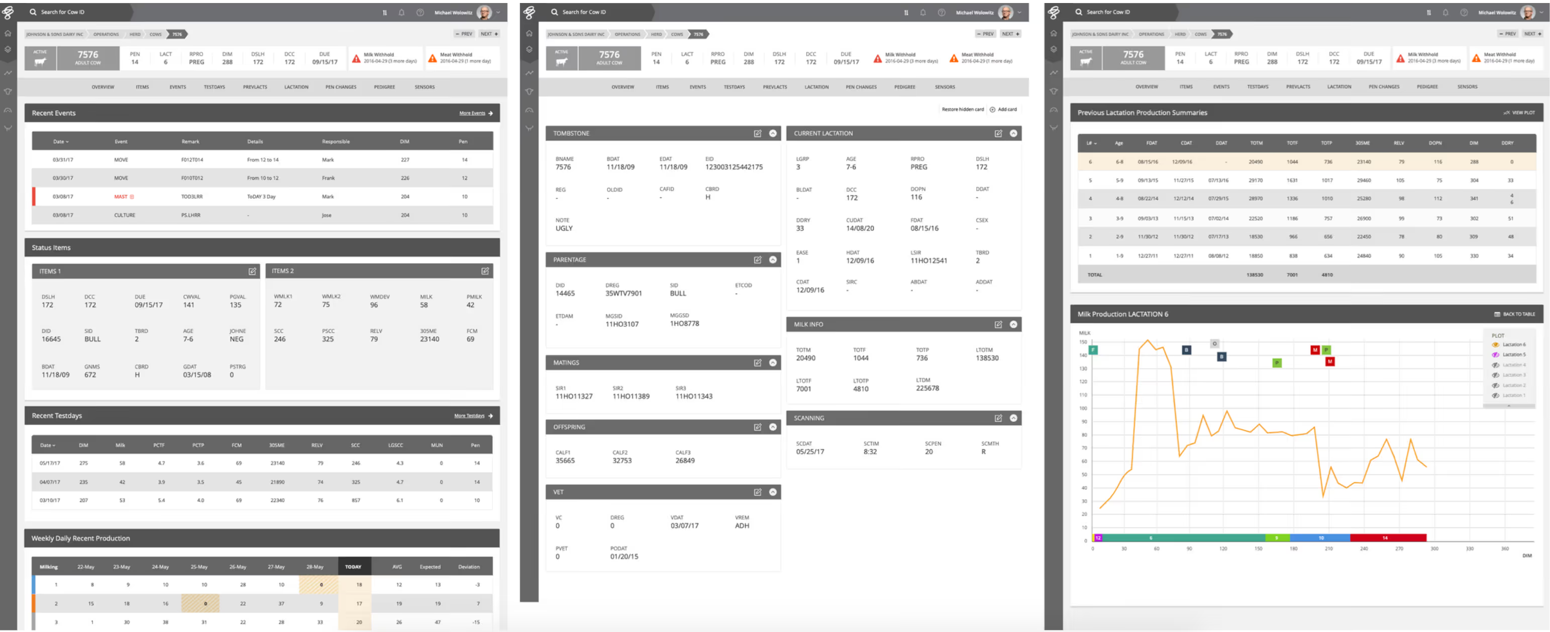
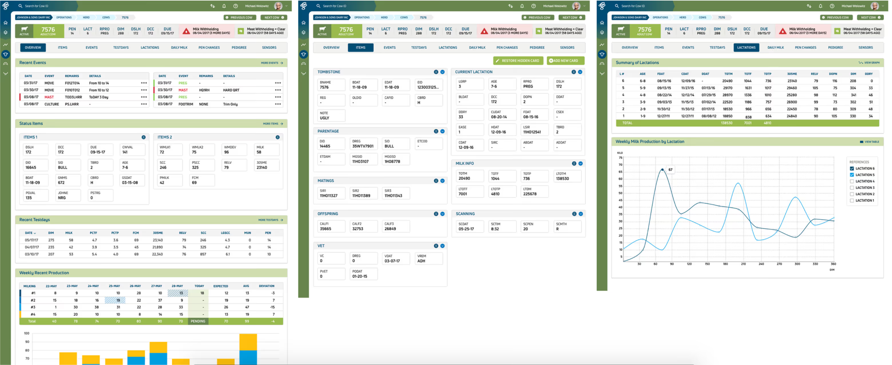
- A modern web platform
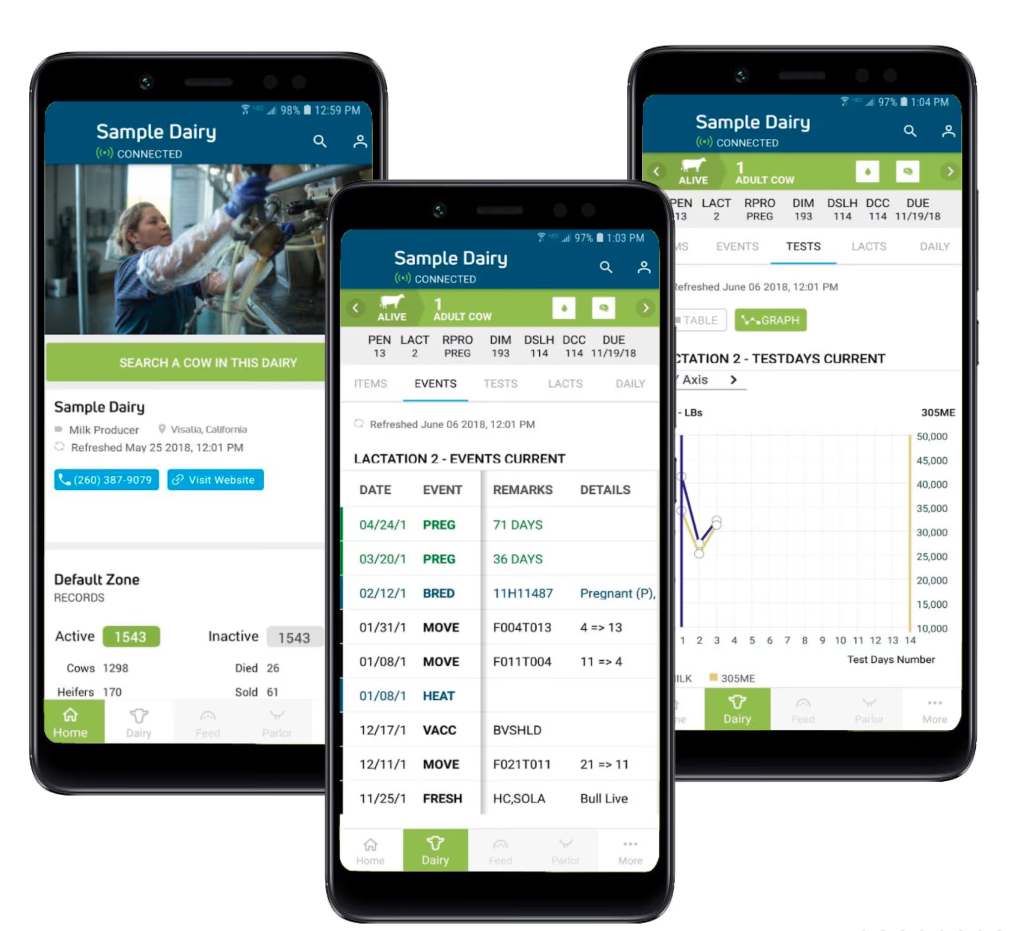
- A field-ready mobile app
- A coherent ecosystem
All while preserving user familiarity and productivity.
Key Constraints
- 30+ years of entrenched desktop workflows and specialised terminology
- Highly specialised users with low tolerance for disruption
- Offline usage requirements for mobile (field work on farms)
- Strong institutional resistance to change
Approach
- Deep Discovery — Studied workflows and system architecture in detail, running stakeholder interviews to understand what could and couldn't change.
- Information Architecture Redesign — Simplified navigation and grouped fragmented tools into coherent task areas, without eliminating familiar terminology.
- Platform Thinking — Designed the web app as a central management hub, with mobile supporting field work — including offline functionality.

Key Product Decisions
- Preserved critical industry terminology to minimise retraining overhead.
- Designed mobile workflows for real farm environments: low connectivity, field conditions.
- Established cross-platform consistency between web and mobile.
Outcomes
- Improved usability and task efficiency
- Modernized system architecture
- Increased clarity and cross-platform consistency
Reflection
This project strengthened my ability to modernise complex systems without disrupting user trust — a skill that directly informs my fintech and mobile work today.
